What is a component wizard
Component wizards are visual interfaces that can either parametrize a function block or help controlling functions of a component. Component wizards are part of the component and therefore the wizard needs to be registered in the module.yaml. (Component structure and module.yaml)
Code
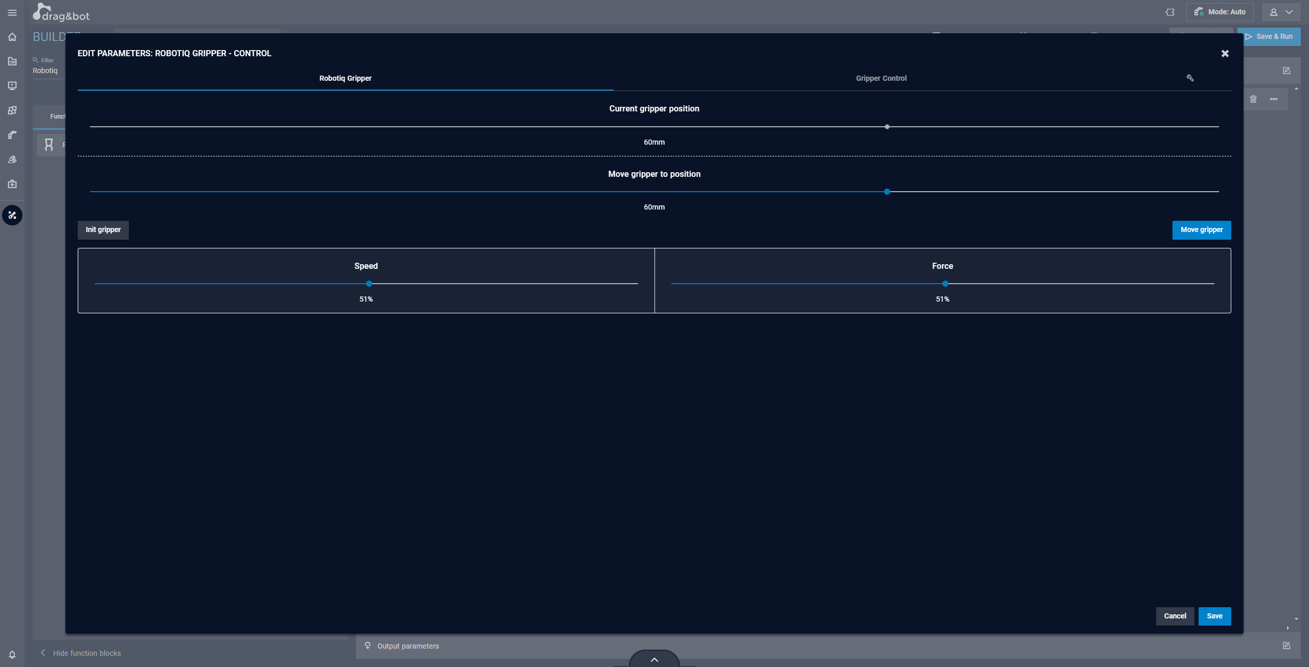
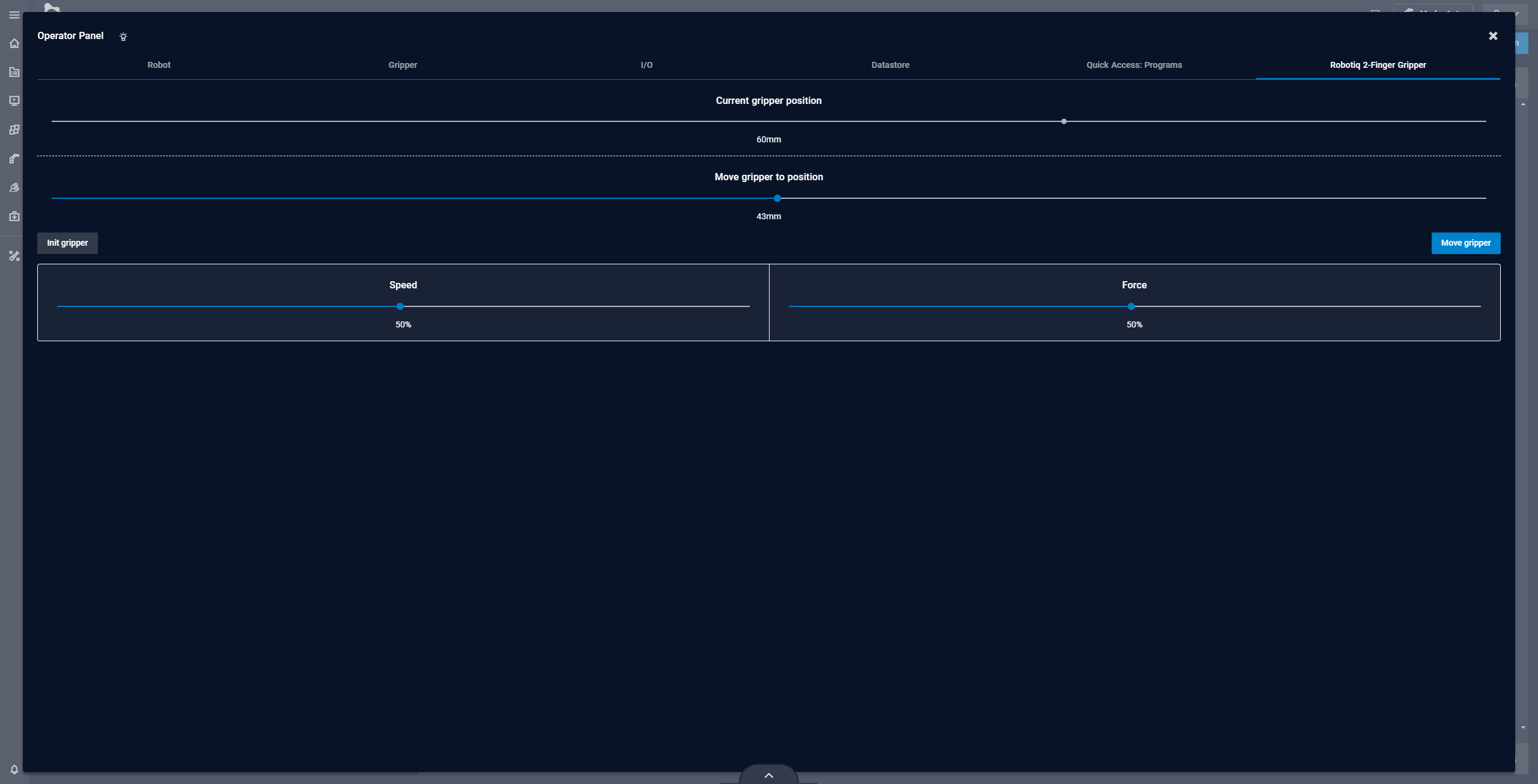
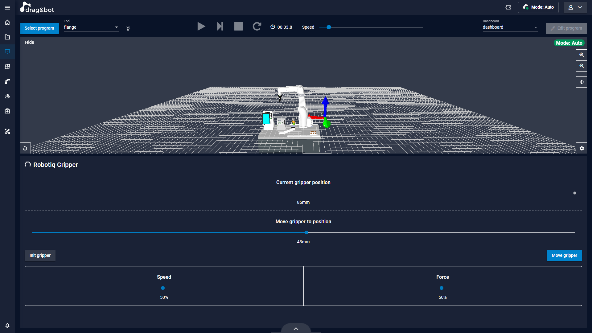
Sample Code on Github  - An example of the Robotiq gripper component.
What can I do with a component wizard
A component wizard can be used for parametrization. Just like any other drag&bot wizard it will show up in the edit parameters view. If there are multiple wizards for the given dataType the component wizard will be selected.
With the optional use_in field it's possible to define where the wizard can be used outside of the classic parametrization context.
use_in needs to be list an can contain one or multiple of following values: a Possible values of the use_in list are operator_panel and operator_cockpit.
operator_panel: the wizard is available as an additional tab in the Operator Panel.operator_cockpit: the wizard can be configured as a panel for the Operator Cockpit dashboard.
Definition
Component Wizards are based on Custom Elements of Webcomponents. The definition needs to be in a single HTML-File. It's recommended to create a wizards directory in the component module.
JavaScript
CustomElements are created in JavaScript. Therefore the HTML-File needs a <script> element, containing all your JavaScript code.
All functionality of the wizard will be put into a JavaScript class. This class must extend WizardElement to get all drag&bot specific functions.
For the creation of a CustomElement you define a new unique HTML-Tag with your class.
class MyWizard extends WizardElement {
    constructor() {
        //super() must be the first call in the constructor
        //and will call the constructor of the extended class
        super();
    }
}
//custom element definition with a tag and the JS class
window.customElements.define('my-wizard', MyWizard);
Special function and properties
To make creating a wizard easier there are multiple function and properties that help with some requirement. For those to work there are some functions and properties of the WizardElement class that must not be overridden.
| Type | name |
|---|---|
| Property | ros |
| Function | connectedCallback |
| Function | initTranslation |
onInit()
Function that's called after the DOM Element is initialized.
rosConnected(ros)
This function is called as soon as the connection to ROS is established. The ROS WebSocket connection is passed as a parameter. In the course of the function call, roslibjs is also added as a property of the class. You can access it with this.ROSLIB. Please note that this is only possible from the first call of the rosConnected function and not, for example, in the constructor.
parameter
To use the wizard to parametrize the corresponding parameter is passed into the wizard. It is recommended to create a getter and setter function for the parameter property as the property will be set during initialization and therefore doesn't have a value from the very beginning.
_parameter;
get parameter() {
    return this._parameter;
}
set parameter(val) {
    this._parameter = val;
    //parameter based initialization
}
translationMap
The translationMap provides translations for the dnb-translate CustomElement.
translationMap = {
    //language key
    en: {
        // SPEED = translation constant
        // Speed = translation
        "SPEED": "Speed",
        "FORCE": "Force"
    },
    de: {
        "SPEED": "Geschwindigkeit",
        "FORCE": "Kraft"
    }
}
JS helperFunctions
The helperFunctions object provides functions that might help you in development.
waitFor
Asyncronous function that waits until the result of a function, provided as parameter, is true. Returns a promise with the result.
helperFunctions.waitFor()
HTML Template
Adding HTML content to the wizard can be done purely in JavaScript code. However, it is recommended to create an HTML template. A unique ID must be assigned to the template in order to use it later. If this ID is made up of the tag of the custom element (e.g. my-wizard) and "-template" (e.g. my-wizard-template) then the template is added automatically.
<template id="my-wizard-template">
    <!-- Your HTML content -->
</template>
dnb Custom Elements
drag&bot provides some custom elements that make creating a wizard easier.
dnb-button
A button with the same styling as the buttons used in drag&bot. With the color attribute it's possible to select the style based on the current theme. Available values for "color" are:
- primary
- success
- error
- default: is no color is set a color of the background scale is used
The dnb-button elements emit the same events a button emits.
dnb-slider
A slider element with drag&bot styling. Has the following attributes:
| Attribute | values | default |
|---|---|---|
| min | number | 0 |
| max | number | 100 |
| step | number | 1 |
| disabled | boolean | false |
| unit | string | "" |
To set or get the value of the slider access the "value" property. Whenever the slider value changes it emits a "change" event. The slider has a connected property which represents the state of the element. If true the slider is initialized and rendered. It's recommended to set the slider value only after connected is true.
<slider id="my-slider" min="10" max="20" step="2"></slider>
slider = this.querySelector('dnb-slider#my-slider');
slider.value = 12;
slider.addEventListener('change', (e) => {
    alert("Slider change");
});
dnb-translate
dnbTranslate helps with translations if a translationMap is set. Based on the values set in the translationMap the corresponding translation for the given translation constant is picked.
<dnb-translate>SPEED</dnb-translate>
CSS
With a style tag it is possible to add CSS to your wizard. Best practice is to add the style tag inside of your template
<template id="my-wizard-template">
    <style type="text/css">
        /*CSS*/
    </style>
    <!-- HTML -->
</template>
my-wizard .text).
Color variables
To create wizards that match the selected drag&bot theme, it is possible to access the colors used through CSS variables.
The colors are available in HEX to use them directly or RGB e.g. if you need to change the colors opacity with rgba.
| Description | Hex | RGB |
|---|---|---|
| Color of the most distant background (darkest background color in a dark theme) | --bg-scale-0 | --bg0-rgb |
| Gradation of background colors | --bg-scale-1 | --bg1-rgb |
| Gradation of background colors | --bg-scale-3 | --bg3-rgb |
| Gradation of background colors | --bg-scale-4 | --bg4-rgb |
| Gradation of background colors | --bg-scale-6 | --bg6-rgb |
| Gradation of background colors | --bg-scale-8 | --bg8-rgb |
| Gradation of background colors | --bg-scale-9 | --bg9-rgb |
| Gradation of background colors | --bg-scale-B | --bgB-rgb |
| Gradation of background colors | --bg-scale-C | --bgC-rgb |
| Gradation of background colors | --bg-scale-E | --bgE-rgb |
| Color of the nearest background (brightest background color in a dark theme) | --bg-scale-F | --bgF-rgb |
| color for foreground elements like text etc. | --foreground-color | --foreground-rgb |
| primary theme color | --primary | --primary-rgb |
| slightly lighter than --primary | --primary-light | --primary-light-rgb |
| slightly darker than --primary | --primary-dark | --primary-dark-rgb |
| color with good contrast to primary | --primary-contrast | --primary-contrast-rgb |
| color with good contrast to primary light | --primary-contrast-light | --primary-contrast-light-rgb |
| color with good contrast to primary dark | --primary-contrast-dark | --primary-contrast-dark-rgb |
| success theme color | --success | --success-rgb |
| slightly lighter than --success | --success-light | --success-light-rgb |
| slightly darker than --success | --success-dark | --success-dark-rgb |
| color with good contrast to success | --success-contrast | --success-contrast-rgb |
| color with good contrast to success light | --success-contrast-light | --success-contrast-light-rgb |
| color with good contrast to success dark | --success-contrast-dark | --success-contrast-dark-rgb |
| warning theme color | --warning | --warning-rgb |
| slightly lighter than --warning | --warning-light | --warning-light-rgb |
| slightly darker than --warning | --warning-dark | --warning-dark-rgb |
| color with good contrast to warning | --warning-contrast | --warning-contrast-rgb |
| color with good contrast to warning light | --warning-contrast-light | --warning-contrast-light-rgb |
| color with good contrast to warning dark | --warning-contrast-dark | --warning-contrast-dark-rgb |
| error theme color | --error | --error-rgb |
| slightly lighter than --error | --error-light | --error-light-rgb |
| slightly darker than --error | --error-dark | --error-dark-rgb |
| color with good contrast to error | --error-contrast | --error-contrast-rgb |
| color with good contrast to error light | --error-contrast-light | --error-contrast-light-rgb |
| color with good contrast to error dark | --error-contrast-dark | --error-contrast-dark-rgb |