Create your own theme
drag&bot provides functionalities to easily create your own custom themes.
Each theme can have a dark and a light mode.
To use a custom theme you need to provide a theme.json file in the directory ~/.dnb/theme
Contents of theme.json
A theme.json can have two properties "dark" and "light". This enables the users to switch between the two modes. If only one of those properties is given only that mode is available and users can't switch.
{
    "light": DnbTheme,
    "dark": DnbTheme
}
{
    // main theme colors
    "primary": string,
    "success": string,
    "successText": string,
    "successContrast": string,
    "warning": string,
    "warningText": string,
    "warningContrast": string,
    "error": string,
    "errorText": string,
    "errorContrast": string,

    // secondary theme colors
    "reference": string,
    "referenceContrast": string,
    "dataflow": string,
    "dataflowContrast": string,

    // background colors

    // settings for generated background colors
    "bgHue": number,
    "bgSaturationFactor": number,

    //specific background colors
    "bgScale0": string,
    "bgScale1": string,
    "bgScale3": string,
    "bgScale4": string,
    "bgScale6": string,
    "bgScale8": string,
    "bgScale9": string,
    "bgScaleB": string,
    "bgScaleC": string,
    "bgScaleE": string,
    "bgScaleF": string,

    // meta infos
    "logo": string,
    "headerLogoHeight": number,
    "favicon": string,
    "pageTitle": string,

    // special settings for the login screen
    "login": {
        "bgColor": "primary" | "dark" | "light",
        "logo": string,
        "additionalLogo": string
    }
}
Main theme colors
Primary Color
The primary color is the main color the theme is build on. Highlights will be set with the primary color. If the theme config contains no settings for background color the background colors are generated based on the primary color.
Default: #007cc2
Success Color
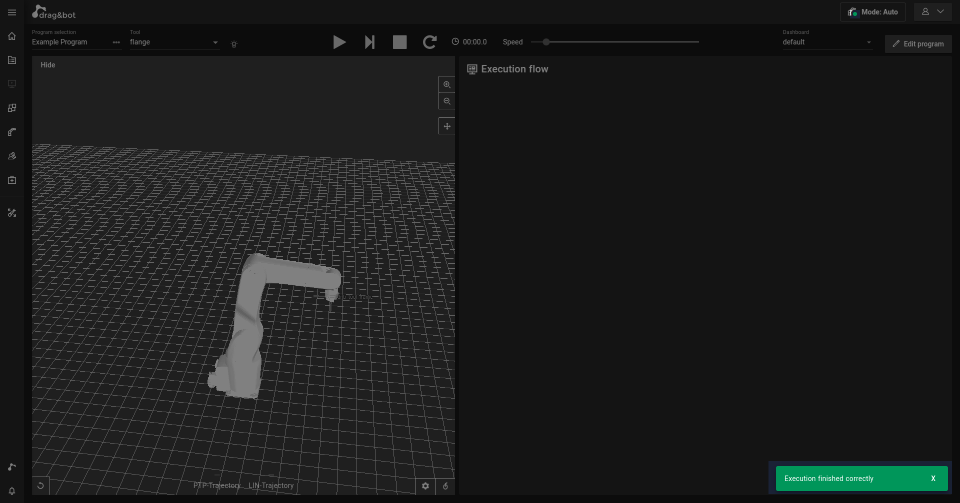
The success color is used to indicate when everything is working correctly. E.g. a program finishing correctly or the robot being connected and running without error. Additionally buttons to finish a process or running a program are marked with the success color.
Default: #00965a
Warning Color
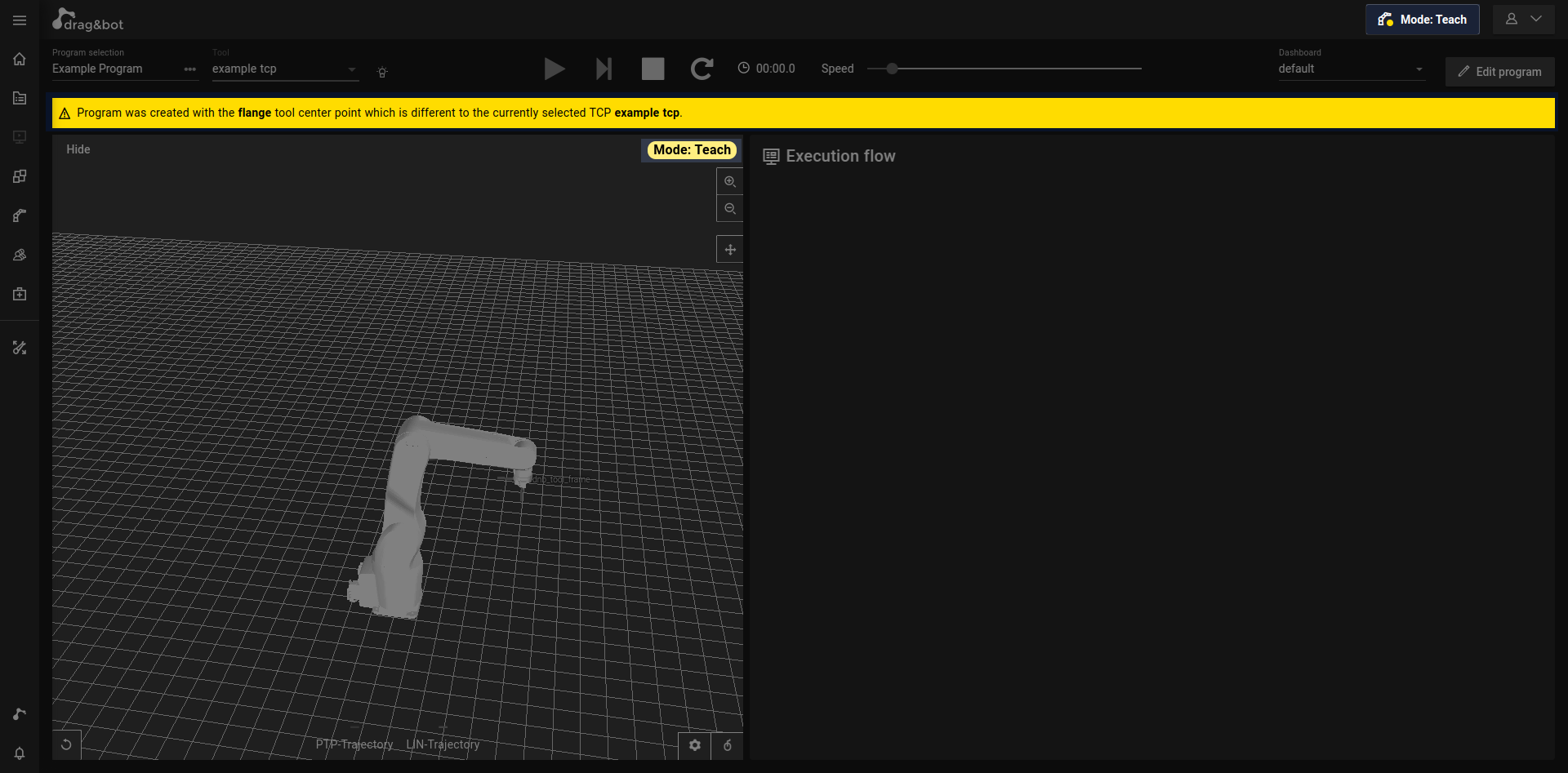
The warning color is used to indicate potential danger which could still be prevented. E.g. robot in teach in mode or the selected TCP is different to the one the program was created for.
Default: #ffdc00
Error Color
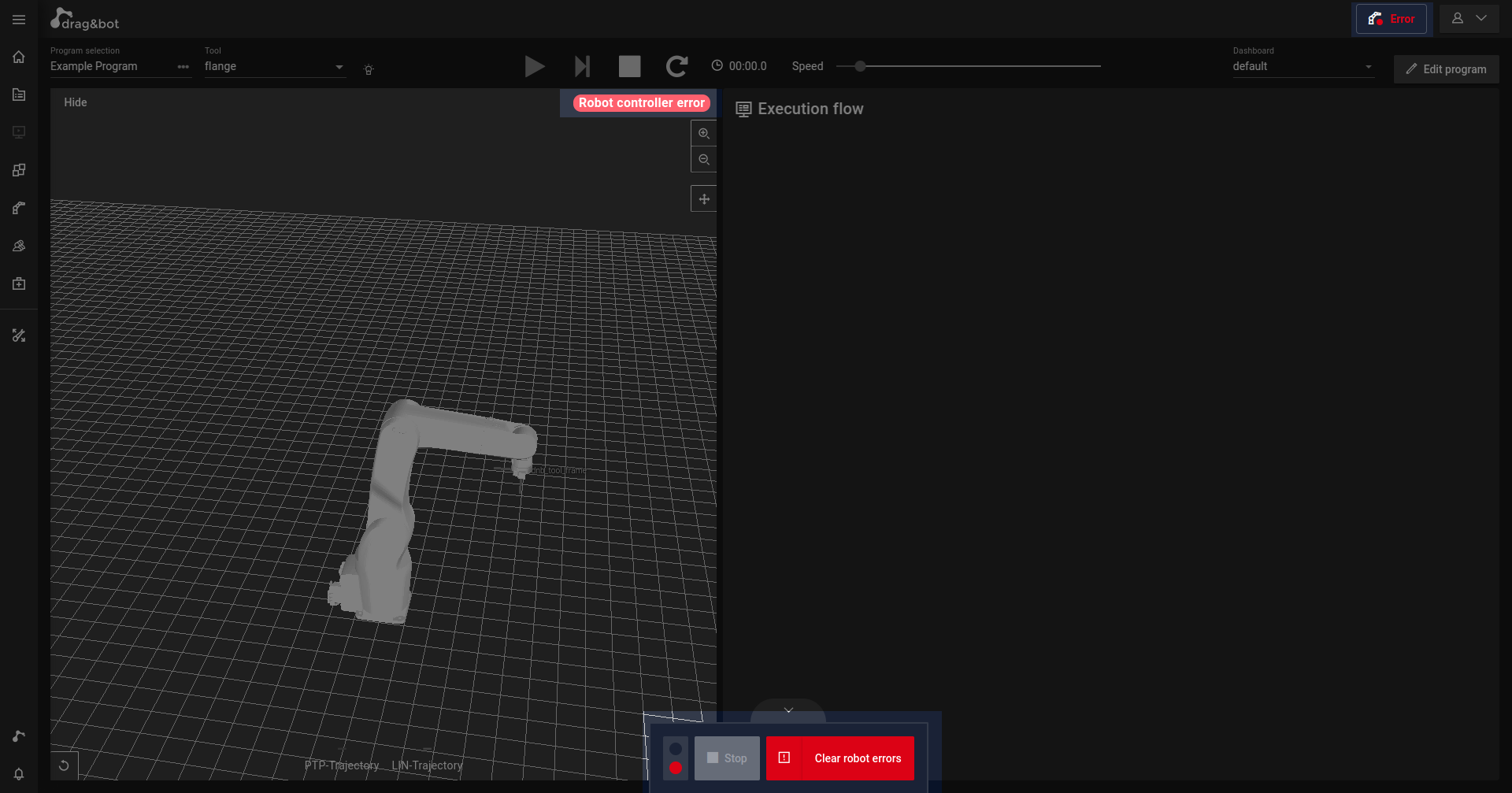
The error color is used to indicate when something finished incorrectly. E.g. a program finished with an error or the robot is an error state.
Default: #dc0215
Text Colors
To prevent having a bad contrast when using text in a theme color it is possible to set text colors. If the text colors are unset they are generated based on each theme color (success/warning/error) and on the current mode.
| Mode | Used color |
|---|---|
| Light Mode | Theme color 5% darkened |
| Dark Mode | Theme color 25% lightened |
Contrast Colors
To always have a good contrast for e.g. text on a button you can also set contrast colors for each theme color. If the contrast colors are unset they are generated based on each theme color. To generate them the color contrasts between the theme color and black and white are calculated. (color contrast as defined by WCAG Version 2) The color with the better contrast is chose as contrast color.
Secondary Theme Colors
Reference Color
Reference color is used to highlight links between parameters.
Reference color is not used for texts therefore it's not possible to set a referenceText color.
To provide a color with a good contrast you can set the referenceContrast color. If it's unset it will be generated the same way as described in the chapter Contrast Colors
Dataflow Color
The dataflow color is used to visualize and highlight the dataflow of a program in the Builder.
Dataflow color is not used for texts therefore it's not possible to set a dataflowText color.
To provide a color with a good contrast you can set the dataflowContrast color. If it's unset it will be generated the same way as described in the chapter Contrast Colors
Background Colors
To make setting background colors as easy as possible drag&bot offers multiple ways to achieve your goal.
If no background property is set the background colors will be generated based on the primary color.
If the bgHue property is set, the background colors will be generated based on the specified hue.
However, it is also possible to specify each individual background color.
The bgSaturationFactor can be used to manipulate the saturation of the generated values. This works both when using bgHue and when using the primary color.
If any background color is explicitly set and bgHue is set, the theme will favor explicitly set colors over generated ones.
BgHue
With bgHue you can specify a hue (0-360) to create background colors based on the specified hue.
You can find out the hue of a color, for example, in the Adobe Color color tool when you change the color mode to HSB.
To experiment with different settings for the background colors, you can try our Background-Color Settings Tool
BgSaturationFactor
With the bgSaturationFactor you can change the saturation of the generated background colors.
To experiment with different settings for the background colors, you can try out our Background-Color Settings Tool
BgScale (Advanced)
Instead of letting drag&bot generate all values for the background color, you can also set all or individual colors to a specific value. This is possible by using the bgScale properties. If a bgScale property is set, the value is used and overrides all generated values for that specific color.
Scale Structure
The background color scale has the following colors:
- bgScale0
- bgScale1
- bgScale3
- bgScale4
- bgScale6
- bgScale8
- bgScale9
- bgScaleB
- bgScaleC
- bgScaleE
- bgScaleF
bgScale0 is used for elements that are furthest in the background. Whereas bgScaleF is used for the elements that are furthest in the foreground.
The colors in between are used for grading the color scale.
This means for a dark and a light theme the colors are reversed.
| Theme mode | bgScale0 | bgScaleF |
|---|---|---|
| dark | darkest color | brightest color |
| light | brightest color | darkest color |
Meta Info
To complete the look and feel of your theme you can also change some more information, like the logo or the title of the webpage.
Logo
The logo property lets you replace the drag&bot logo with a logo of your choice. All you need to do is to provide a link to the logo. The link can lead to a different website or load the logo from the same server. We recommend putting the logo file next to the theme.json in the theme directory. If you do so you can, for example reference it with:
"logo": "logo.jpg",
"logo": "images/logo.jpg",
HeaderLogoHeight
By default the logo in the header bar will always use 100% of the height available. If this is does not look the way you want it to look you can reduce the height of the logo by using the headerLogoHeight property. This property takes a number between 0 and 1 and is used to scale the logo in the header bar.
Favicon
With the favicon property you can change the pages favicon. A favicon is a small image displayed next to the page title in the browser tab. The favicon can be changed by providing a link similar to changing the logo.
PageTitle
The pageTitle property enables you to change the title of the webpage.
The pageTitle is, for example used in the tab of your browser next to the favicon.
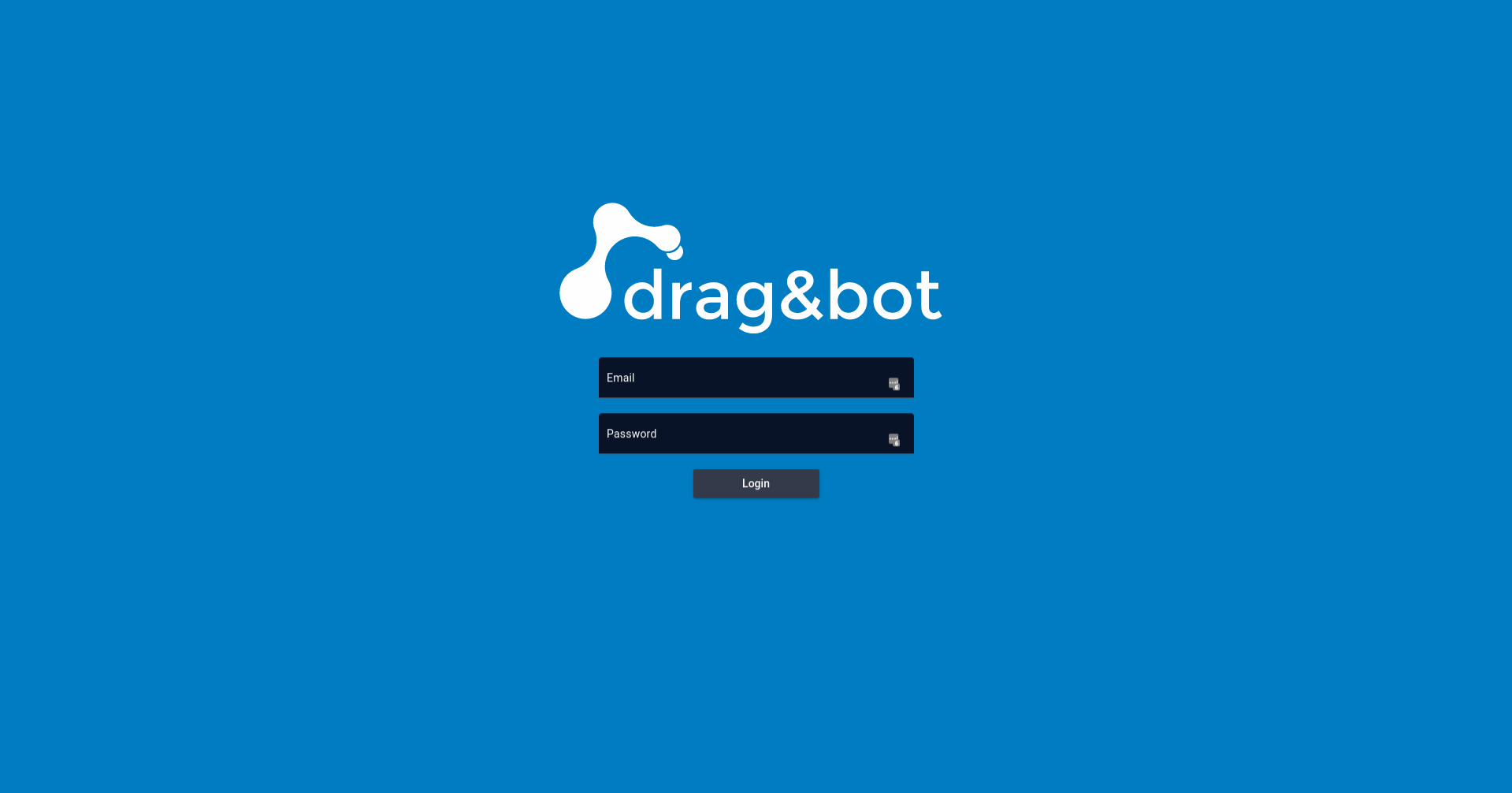
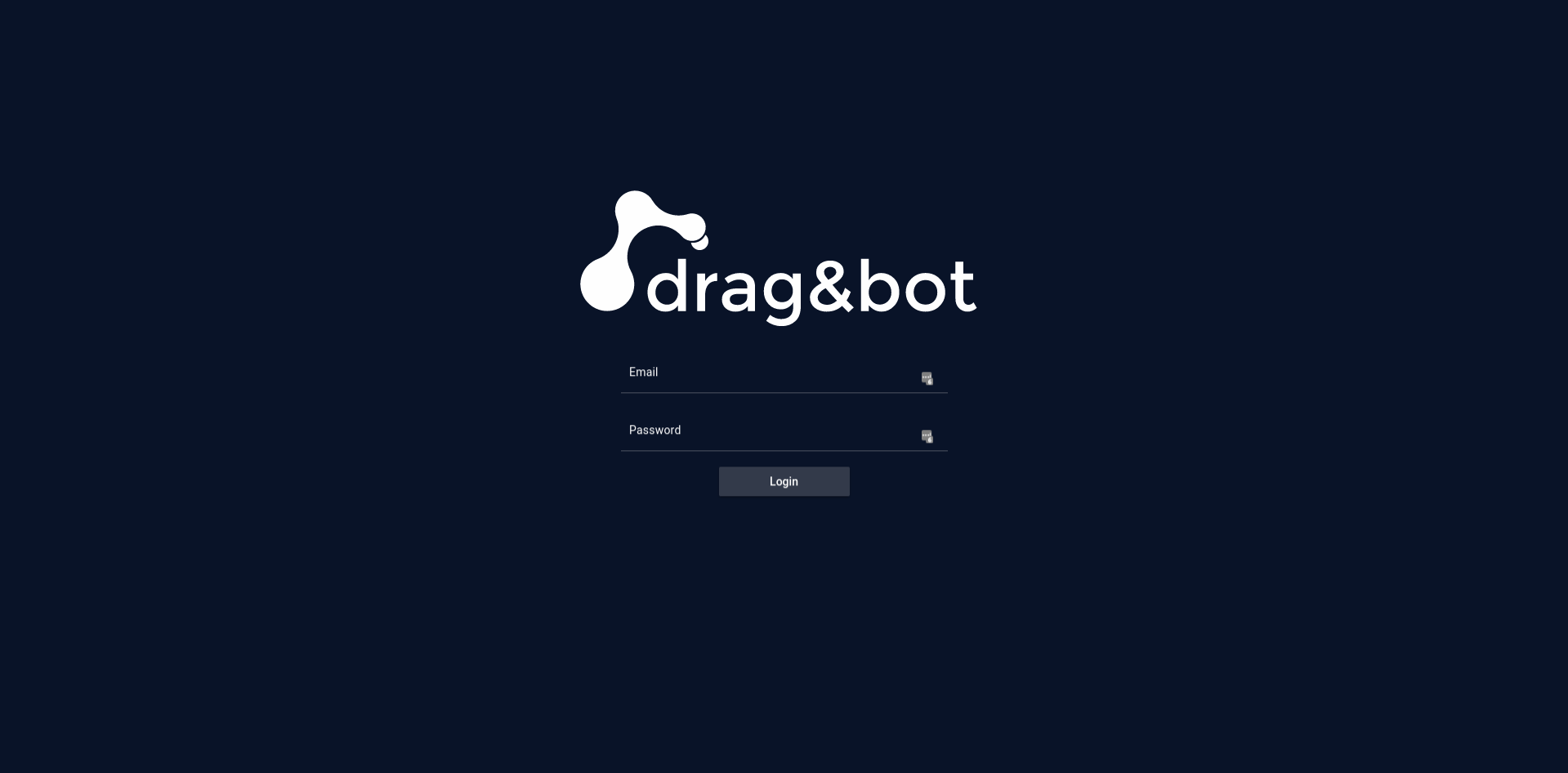
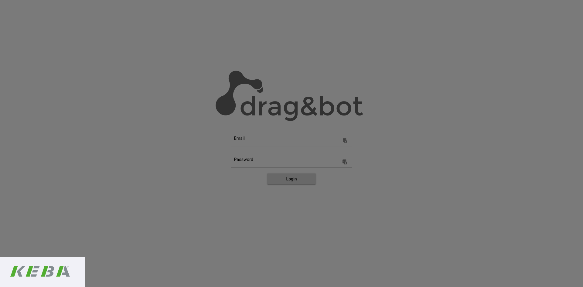
Login
The login object offers properties to change the style of the login page.
| Property | Effect |
|---|---|
| bgColor | change the background color of the login page without changing other parts of the webpage |
| logo | change the logo shown on the login page separately |
| additionalLogo | add an additional logo to the login page, which will be displayed in the lower left corner |
BgColor
The bgColor property of changes the background color of the login screen.
It is not possible to set any color, but to select from three given values:
- "primary" sets the background color to the primary color of the current theme. This is the default setting.
- "dark" sets the login background color to the darkest background color of the theme.
- "light" sets the login background color to the brightest background color of the theme.
We recommend to always use either the setting matching the current mode (for light mode -> light login screen) or the primary.
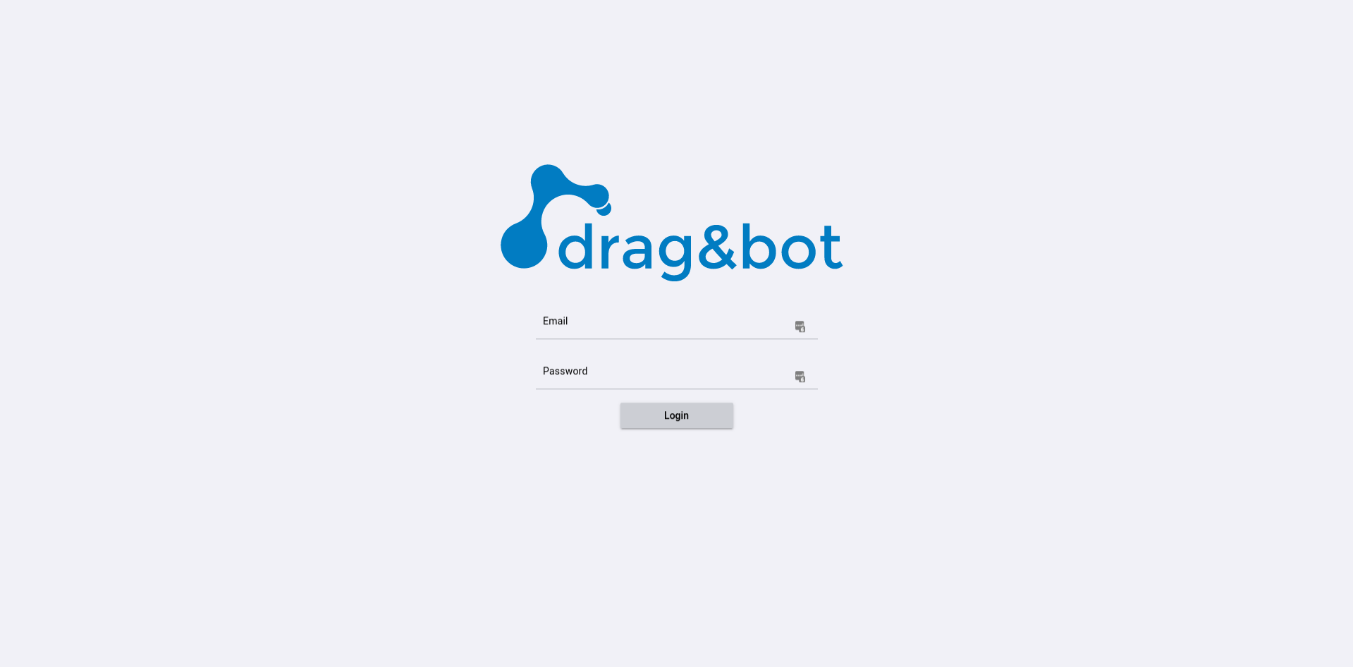
Logo
Using a different background color for the application and the login page can result in a bad contrast between the logo you defined previously and the login background.
For this case and all other cases where you want to use a different logo for the login page you can use the logo property in the login object.
Defining a logo for the login page works the same way as defining the general logo for the application. When providing a link to a logo for the login page, instead of the general logo defined in the theme.json the specified logo is used.
AdditionalLogo
If you want to add a second logo to the login screen you can use the additionalLogo property of the login object. For example if the application itself has a different logo than your company you can add the company logo as additional logo. The additional logo will be displayed in the bottom-left corner of the login screen and can have a maximum size of 200px x 200px.
As for all other logos you need to provide a link to the logo file.
Examples
You can try theses examples by unzipping and pasting the content into ~/.dnb/theme.